
Green Is In
- emilyroxandich
- Dec 27, 2023
- 3 min read
With the modern kitchens, there has been an overwhelming amount of white in both cabinetry, countertop and backsplash selections. There's white everywhere and to put it simply, here at sereine, we were getting a little bored.

That is, until we met with these clients. They were in no way scared of color. Immediately upon seeing their inspiration pictures, we knew we were in for a treat. Not only were these clients not afraid of color but they were open to changes in cabinetry a floor plan, which is what made this kitchen an absolute Masterpiece!
Interior design at its core should be both fun and interesting. So, we got busy creating a mood board that was just that...

From the Kohler sink to the pendants in the kitchen, every accessory was thoughtfully selected to create the beauty you see here. Our design clients were immediately on board and we were ready to move forward to the next design phase - kitchen selections.
There are so many components that made this room spectacular, but for now we are going to share with you some of the most impactful interior design decisions.
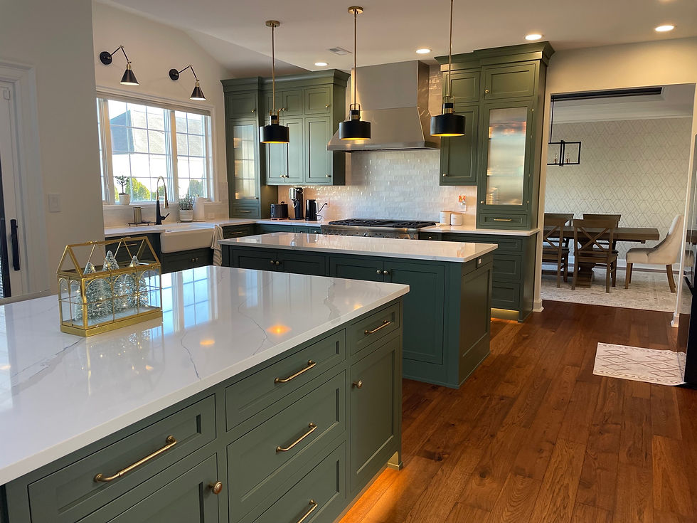
CABINETS
The cabinet color was the biggest decision. The color was the drive behind the whole design and helped lead our selections for all other items throughout the kitchen. We wanted a paint color that was neutral enough to not get tired of (or clash with the bar in the next room) but then also that added a pop. These clients were in love with this color as soon as they saw it.
The Cabinet color:
Sherwin Williams - Rosemary
It is both neutral and daring. Being that it is anything but white, we were all instantly in love. This Sherwin Williams color was used all throughout the kitchen on islands and perimeter. How beautiful do these kitchen cabinets look? 🤩
With a color like this, it's very important to be thoughtful about your other decisions in the room including: countertop, backsplash and fixtures. All of the items should play well with one another!
FLOORING

The flooring throughout was a huge part of the overall design. We opted for more of a walnut toned selection, and encouraged our clients to embrace the warmer and redder undertones in any floors they considered.
The color not only complimented the cabinets, but it also warmed up the space and added depth. Although white oaks are in (and we're not mad about it) the color can come off a little lifeless when combined with such a complex green. These floors are able to handle the color and shine as well making the whole design a little more cohesive.
A little color theory also helped us make the decision. If you want to optimize the impact of a color in a space, select an accent that trends towards the opposite side of the color wheel.
In this particular case the greens are accentuated by the red undertones in the floor.
These floors SHINE in the design. Not only do they add depth, but the color makes the entire area seem rich and luxurious.
The Flooring Selection:
Hallmark Floors
Grain and Saw Collection in Stickley Hickory
THE BACKSPLASH
The backsplash selection was a zellige selection in a standard subway size (3x6"). Go to your local showrooms to see what options they have!
The beauty behind a zellige tile is the handmade quality of the tile. Each tile in a traditional zellige color palette will have its own unique color in whatever pattern you choose. With that being said, you want to make sure you have a skilled tile intaller who can install the tiles in a mixed fashion. The tiles should be laid out on the wall with the variation in colors spread evenly throughout the space. Depending on the project, I will personally hand pick each tile to ensure that the mixture is laid evenly. I'll show where I've done this in later blogs!

Some of the other noteworthy design aspects we would like to point out are :
THE DOOR STYLE AND ISLAND COLUMNS
Every door kitchen deserves its own unique door style. Especially when we are working with a custom kitchen we always like to take advantage of the numerous options and tiny details that set each kitchen apart from others.
This particular kitchen we opted for a smart upgrade from a traditional shaker style. Plus, we added large base columns to the island in a coordinating style.


Instead of a standard shaker you can see that this door style has a slightly softer inside detail. The flat horizontal plain of a standard shaker was replaced by an angled inside profile. It softened the appearance of the door and was a perfect way to compliment the transitional style of our clients overall design style.
We absolutely loved sharing some of the design details from this design and cannot wait to continue to post more. Stay tuned!
The Team at Sereine.


Comments